
Task
Design a newsletter app from scratch, focused on improving long-term user retention.
Final Designs
The final designs prioritize immediate access to relevant content, clear visual hierarchy, and calm, habit-forming interactions. Personalized content, lightweight progress cues, and contextual tools reduce friction and decision fatigue, while typography, spacing, and dynamic light and dark color themes support long-form reading and encourage daily return without disrupting focus.
Ideation & Architecture
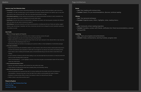
For improving long-term retention, I focused on the following themes:
-
Engaging and intuitive onboarding experience that shows the value of the app and allows a user to start reading immediately
-
Personalized experience, including smart reading recommendations and regular reminders based on observed user patterns
-
Gamification that motivates daily returns by using rewards, challenges, and streaks
I then drafted design principals to keep in mind:
-
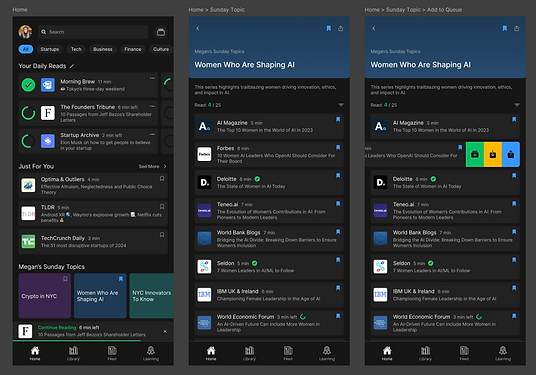
Immediate value within the first interaction: The home screen prioritizes “Continue Reading” and personalized recommendations to reduce decision fatigue and let users start reading within seconds.
-
Calm, focused reading environment: Visual hierarchy, typography, and spacing are optimized for long-form reading, minimizing UI noise while keeping tools easily accessible.
-
Habit formation without distraction: Streaks and goals are present but secondary, designed to encourage return visits without interrupting reading flow.
User Goals, Features, & Wireframes
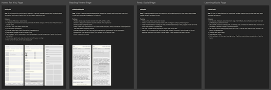
I created user goals for each of the main pages, along with any possible features a user would need to succeed in those goals. I also designed low-fidelity wireframes of the screens I would prototype.
Some of the users goals include:
-
Home Goal: To discover exactly what you want to read within 8 seconds (average attention span) with personalized discovery of new content as well as all of the user’s typical reads in one spot.
-
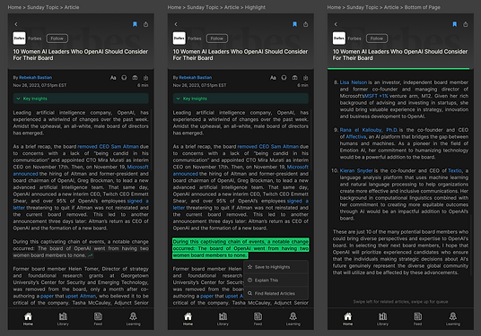
Article Viewer Goal: To create a seamless reading experience that allows a user to easily read, process, and understand writings while encouraging engagement and retention.
Design System
I read several studies on the best colors to use for digital reading and the most readable fonts across demographics to develop a quick design system. Because most people use their phone for reading news in the early morning or late at night, I suggest a dynamic color system that switches between light and dark mode automatically depending on the time of day.
